
Rやpythonでは分布の可視化の方法としてrugplotと呼ばれる作図手法が利用可能ですが、GTLでも同様の作図が可能です。ただし機能は前者よりも劣ります。
Rugplotとは
Rugplotはヒストグラムと同様にデータの分布を可視化する作図手法で、軸の周辺に設置します。rugplotは一次元の散布図またはビンサイズが0のヒストグラムとみなすことができます。すなわち個々のデータを同じ長さの細い線として表示します。ちょうどバーコードをような見た目です。データが多いと線同士が区別しずらくなるため、データ数がそこまで多くない場合には有効かと思います。逆にデータ数が多い場合はヒストグラムのほうが見やすいかもしれません。
ヒストグラムと異なり作図エリアが少なく済むのはメリットといえるでしょう。
rugplotは単体では使用せず、密度プロットや散布図と併用することが多いようです。
GTLではfringeplotステートメントで作図可能です。RとpythonはrugplotというステートメントなのになぜSASは名称が異なるのでしょうかね?
fringeplotステートメント
GTLのfringeplotステートメントは単純に作図したい変数を指定するだけで作図することができます。
fringeplot < variable > / < options >;
しかし作図可能なのはX軸変数のみでY軸変数は作図できません。Rとpythonは両軸ともに作図可能なのですが、SASでは同様の作図は実現できません。Y軸変数の周辺分布を作図する場合はヒストグラムを採用するしかなさそうです。
実際に作図してみます。支払総額とチップ額を散布図として表示し、支払総額の分布をrugplotとして表示します。
proc template ;
define statgraph rug;
begingraph;
layout overlay /
   yaxisopts=(offsetmin=0.1 offsetmax=0.1);

   scatterplot x=total_bill y=tip /
      markerattrs=(symbol=circlefilled)
      datatransparency=0.3
      name="scatter";
   fringeplot total_bill /
      datatransparency=0.3;
endlayout;
endgraph;
end;
run;

proc sgrender data=import template=rug;
run;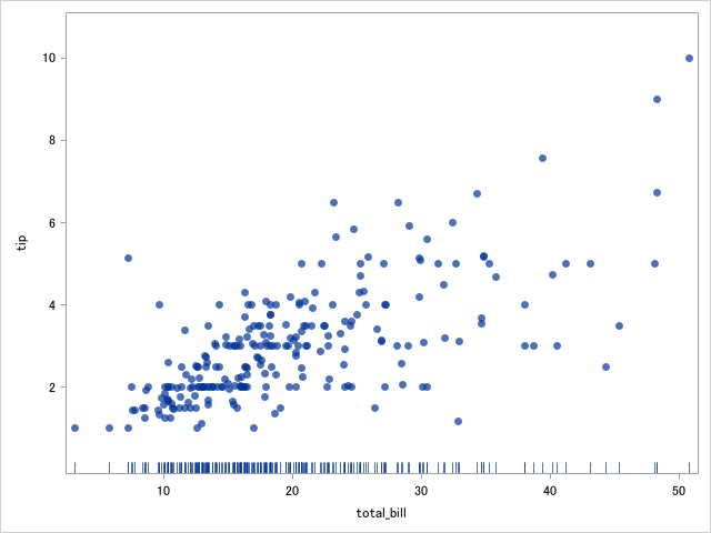
またgroupオプションを追加することで、群変数ごとに色分けすることができます。上記のグラフを修正して昼食と夕食でマーカとrugpplotのバーの色を塗り分けて表示します。
proc template ;
define statgraph rug;
begingraph;
   layout overlay /
      yaxisopts=(offsetmin=0.1 offsetmax=0.1);

   scatterplot x=total_bill y=tip /
      group=time
      markerattrs=(symbol=circlefilled)
      datatransparency=0.3
      name="scatter";

   fringeplot total_bill /
      group=time
      datatransparency=0.3;

   discretelegend "scatter";
endlayout;
endgraph;
end;
run;

proc sgrender data=import template=rug;
run;
これでも十分ですが、rugplotが重なりすぎてわかりにくいため、プロットエリアを分割し、Time毎にrugplotを作図します。
プロットエリアを3分割して上から散布図、rugplot(time=Lunch), rugplot(time=Dinner)の順に作図します。
rugplotはeval関数とifn関数を併用することで、作図対象外のtimeのデータを欠損値に置換して変数の導出なしでデータの切り替えています。
proc template ;
define statgraph rug;
begingraph;
discreteattrmap name="attrmap";
value "Lunch" / lineattrs=GraphData1(pattern=solid) markerattrs=GraphData1(symbol=circlefilled);
value "Dinner" / lineattrs=GraphData2(pattern=solid) markerattrs=GraphData2(symbol=circlefilled); enddiscreteattrmap;

discreteattrvar var=time attrmap="attrmap" attrvar=_grp;

   layout lattice /rows=3 rowweights=(0.9 0.05 0.05)
      columndatarange=union;

      columnaxes;
         columnaxis / label="Total bill";
      endcolumnaxes;

      layout overlay / yaxisopts=(offsetmin=0.1 offsetmax=0.1);
         scatterplot x=total_bill y=tip /
            group=_grp
            markerattrs=(symbol=circlefilled)
            datatransparency=0.3 name="scatter";
         discretelegend "scatter" /
            location=inside
            autoalign=(topleft topright bottomleft bottomright);
      endlayout;

      layout overlay;
         fringeplot eval(ifn(time="Lunch",total_bill,.)) /
            group=_grp;
      endlayout;

      layout overlay;
         fringeplot eval(ifn(time="Dinner",total_bill,.)) /
            group=_grp;
      endlayout;
   endlayout;
endgraph;
end;
run;

proc sgrender data=import template=rug;
run;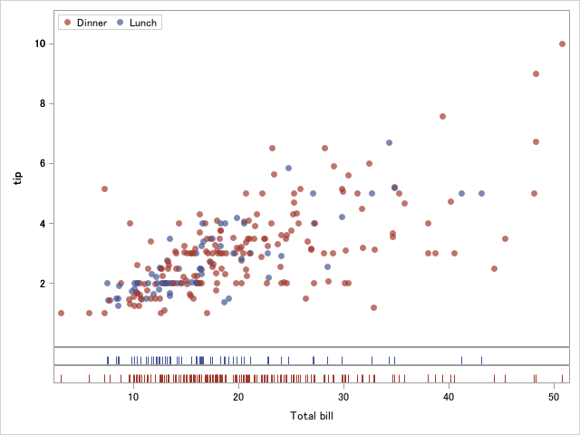
SAS公式ではfringeplotをヒストグラムと併用していることが多いですが、データの分布を可視化するという意味ではどちらも役割が同じなので、どちらかというと散布図または密度プロット(2次元の場合は等高線プロット)と併用するケースのほうが多い印象です。散布図とrugplotの併用の場合は、GTLはあきらめてRのggplotかpythonのseabornを使ったほうが良いでしょう。
fringeplotは低機能なので正直使いどころはあまりありません。GTLで同様の意味を持った作図をするのであれば周辺ヒストグラムを採用したほうが良いと思います。