waterfall chartは抗がん剤研究で抗腫瘍効果を見る時に見かけるグラフです。
GTLおよびsgplotではwaterfallchart ステートメントというステートメントが用意されていますが、臨床分野ではベースラインからの変化量をプロットするので、
通常の棒グラフを組み合わせて作図します。
waterfallチャートとは
waterfallチャートの概要は以下の論文で紹介されています。

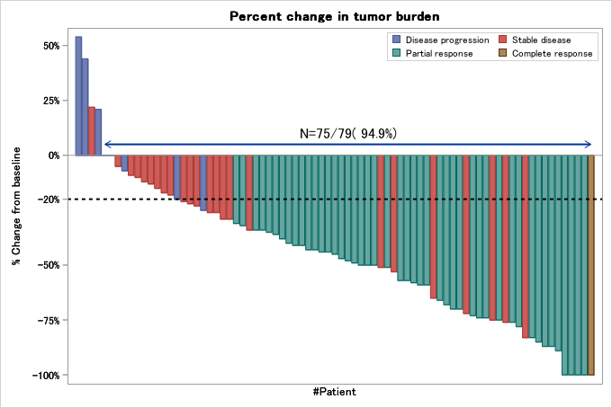
ウォーターフォールチャートは、個々の患者ごとに応答変数(例えば腫瘍サイズの変化率など)を図示するときに用いられます。
要約統計量ではなく個々の患者の結果とその患者の治療結果をグラフ化できる点がメリットです。
患者はあらかじめ応答変数の大きさに従って並べ替えるのが一般的です。普通はグラフの左から右へ、あるいは上から下へ状態が良くなる順に並べ替えます。
応答変数の大きさは棒グラフとして表現します。1つの棒グラフは1人の患者に対応します。患者の治療成績は棒グラフの色やマーカーで表現します。
個々の患者にフォーカスして考察しやすいですが、治療期間に関する考察は当然できないので、カプランマイヤープロットなどと併用することが一般的かと思います。
またwaterfall chartの作図方法はSASの公式ブログでも紹介されています。

作図方法
sgplotでも作図できますが、ここでは上記のSAS公式で紹介されたテストデータを利用してGTLで作図してみます。
作図データセット
まず応答変数の大きさを基準にレコードを並び替え、連番を付与します。この連番をX軸の変数とします。
患者ID自体を軸変数に指定することもできますが、患者IDが文字列型だと重ね書きできるグラフに制限がかかるため、
今回は軸変数を数値変数として新規作成します。
今回はベースライン減少率が0以下のなった患者数と全体に占める割合を矢印とラベルで表示します。
freqプロシジャで集計し、集計結果を整形してラベルテキストを作成します。
矢印とラベルのx座標は減少率が0以下となった患者のうち、減少率が最大の患者と最小の患者の表示位置を基に決定しました。
y座標は定数を入力しています。グラフの体裁に応じて微調整してください。
proc format;
value RECISTFmt 1='Disease progression'
2='Stable disease'
3='Partial response'
4='Complete response';
run;
data Tumor;
format PatientID z4. Response percentN7. RECIST RECISTFmt.;
input PatientID Response RECIST;
if response<=0 then flg=2; else flg=1;
/* 変化量が0以下の場合 flg=2 */

datalines;
1001 -0.75 2
1002 -0.73 3
1003 -0.51 2
1004 -0.09 2
1005 -0.10 2
1006 -0.17 2
1007 -1.00 3
1008 -0.83 3
1009 -0.65 2
1010 -0.53 2
1011 -1.00 4
1012 -0.48 3
1013 -0.47 3
1014 -0.85 3
1015 -0.58 3
1016 0.54 1
1017 -1.00 3
1018 -0.68 3
1019 -0.25 1
1020 0.21 1
1021 -0.87 3
1022 -0.21 2
1023 -0.29 2
1024 -0.20 1
1025 -0.43 3
1026 -0.50 3
1027 -0.74 3
1028 -1.00 3
1029 -0.36 3
1030 -0.44 3
1031 0.22 2
1032 -0.59 3
1033 -0.26 2
1034 -0.89 3
1035 -0.57 3
1036 -0.72 2
1037 -0.76 3
1038 -0.66 3
1039 -0.44 3
1040 -0.31 3
1041 -0.40 3
1042 -0.57 3
1043 -0.74 3
1044 -0.13 2
1045 -0.07 1
1046 -0.05 2
1047 -0.29 2
1048 -0.51 3
1049 -0.70 3
1050 -0.35 3
1051 -0.43 3
1052 -0.34 2
1053 -0.87 3
1054 -0.34 3
1055 -0.59 3
1056 -0.45 3
1057 -0.26 2
1058 -0.22 2
1059 -1.00 3
1060 -0.75 3
1061 -0.83 2
1062 -0.38 3
1063 -0.70 3
1064 -0.12 2
1065 -0.32 3
1066 -0.15 2
1067 -0.49 3
1068 -0.50 3
1069 0.00 1
1070 -0.41 3
1071 -0.41 3
1072 -0.50 3
1073 -0.76 2
1074 -0.78 3
1075 -0.18 2
1076 0.00 1
1077 0.44 1
1078 -0.23 2
1079 -0.34 3 ;


proc sort; by descending response recist;
run;

/* 軸変数xを作成 */

data tumor2;
set tumor; by flg;
retain x; x+1;
run;
/* 腫瘍サイズが減少した症例数を集計 */

proc freq data=tumor;
tables flg / out=shukei;
run;

/* 腫瘍サイズが減少した症例数と割合をマクロ変数に格納 */
data _null_;
set shukei;
retain total;
total+count;

/* ラベルを作成 */
if flg=2 then do;
   call symputx("pct", "N="||strip(put(count,8.0))|| "/" || strip(put(total,8.0))|| "(" || put(round(percent,0.1),5.1) || "%)" );
end;
run;

 %put &pct;
*矢印とラベルの設定;
data vector;
length text $50;
set tumor2;
by flg;
retain xstart;
if first.flg and flg=2 then xstart=x;
if last.flg and flg=2 then do;
   xend=x;
   ystart=0.05;
   yend=0.05;
   text="&pct.";
   posx=(xstart+xend) /2;
   posy=0.1;
   output;
end;
keep xstart xend ystart yend text posx posy;
run;

*作図データセット;
data graph;
merge tumor2 vector;
run;
棒グラフはbarchartparm, 矢印はvectorplot, ラベルはtextplotで作成します。